Most teams notice inconsistent motion, but they usually blame execution.
Different styles, different transitions, different pacing across content. It looks messy, so the instinct is to fix the design.
But inconsistency in motion is rarely a talent problem. It is a systems problem. When there is no shared structure for how motion should behave, every piece of content ends up being solved from scratch.


Small inconsistencies don’t feel dramatic.
A new caption style, different font, or trendy color palette. None of it feels major in isolation.
But branding takes time to compound. And inconsistency threatens this.
When your motion branding shifts constantly, you weaken recognition, lower retention, and look like a hot mess.
Open your feed.
Now imagine someone scrolling past your content.
Can they recognize it without reading your name?
A consistent color palette, a repeatable layout, a recognizable filming setup, and a familiar face on the thumbnail all make it easier for someone to identify your content instantly.
Creators already understand this instinctively. They see a familiar face on their feed and are excited to watch their new content.
Their recognition is part of the hook.
If your thumbnails, captions, and layouts change constantly, you force your audience to re-learn your brand’s face every time.
And that is costing you attention.
Branding is not lipstick. It’s pattern recognition.
When someone quickly scrolls, they’re not checking the profile. They’re reacting to color, typography, pacing, and faces.
The faster someone recognizes your content, the faster they engage.
Consistent motion branding:
If viewers can’t identify you in two seconds, they won’t watch.
Small visual decisions are often where consistency breaks down. Not because teams lack taste, but because they lack systems.
Typography is one of the fastest ways to weaken recognition.
Creators experiment with trendy fonts, rotate presets, or change caption styles depending on the platform. Over time, the visual voice shifts.
Strong brands don’t rotate typefaces weekly. They define a clear system: a hero font, one or two supporting fonts, and consistent hierarchy rules.
When typography changes constantly, brand recognition resets. The goal isn’t novelty. It’s familiarity.
A palette can look beautiful in a brand deck and fail completely on video.
On social, your colors live on top of footage. Type must stay legible across bright scenes, dark scenes, and fast motion.
If captions disappear into the background or type lacks contrast, clarity AND retention drop.
A motion ready color system prioritizes contrast, legibility, and repeatability. If it doesn’t work on real footage, the designs are theoretical.
Most modern brands aren’t simple. They have lots of offers and ways to monetize.
You might have:
Each offer can have its own flavor, but they must work together as a meal.
There should be a larger visual language that ties everything together.
A defined typography system, a consistent color logic, a recognizable pacing rhythm, and repeatable framing devices tie everything together under one visual language.
Sub-brands can vary, but the umbrella must be unmistakable.
In a crowded, noisy online world, branding is how you define who you are and who your content is for. Your brand is your moat.
When your visual language is distinct and consistent, you differentiate yourself from competitors who rely on generic presets.
You attract the right audience. The people who resonate with your tone, your pacing, your visual identity.
A well defined brand stays top of mind, builds trust, and grabs attention.
This is not just aesthetic theory. It’s commercial reality.
Inconsistent motion branding:
If someone clicks from social to your website and the brand feels like it belongs to someone else, trust drops. And then they bounce.
Their unmet expectations kill a conversion.
Consistent branding, on the other hand, builds trust across every touchpoint. It makes your content feel intentional, established, and professional.
Even if it’s subconscious, your customers notice.
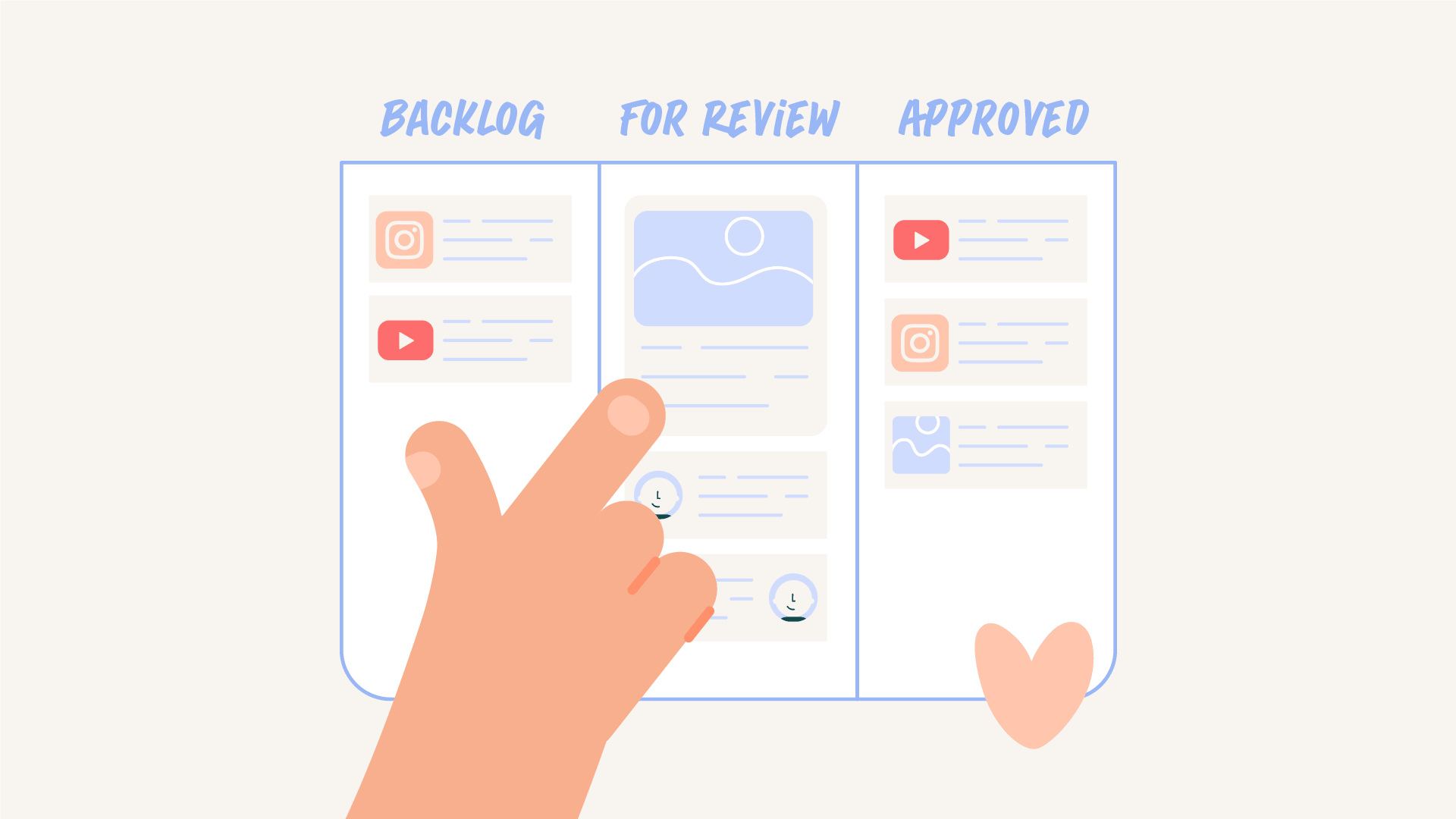
Most branding issues aren’t taste issues. They’re how you put it into practice.
When teams don’t have defined motion toolkits, caption presets, thumbnail frameworks, and typography rules, they improvise.
Improvisation leads to inconsistency, a weakened brand, and loss of leverage.
And leverage determines your pricing power, your sponsorship value, and your long term growth.
You spend hours filming. Editing. Refining your message. Strategizing. Posting consistently.
And then at the last minute, you slap on a preset caption style. Swap in a trendy font. Grab a random color just to get it live.
All that effort… undermined by inconsistency.
You can still grow like this.
But you’ll work twice as hard for half the results.
Consistency is what makes growth take off over time.
Without it, every post fights alone.
Motion feels inconsistent when there is no shared system guiding how animation should behave. Without defined patterns, each designer makes different decisions which leads to variation across content.
Not usually. Even strong designers will produce inconsistent work if there is no system in place. The issue is structure, not skill.
Motion systems define how elements move, transition, and behave across content. This creates a shared language that makes animation feel cohesive even across different projects.
Creating motion from scratch leads to inconsistency and slower production. It also makes it harder for teams to scale content because there is no repeatable foundation.
Teams can fix it by defining a set of motion principles and reusable behaviors. Over time these patterns become a system that supports both consistency and efficiency.

Motion Partner